18.07.2023
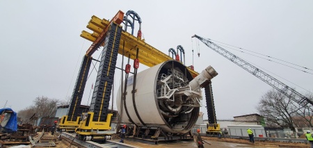
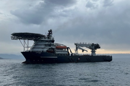
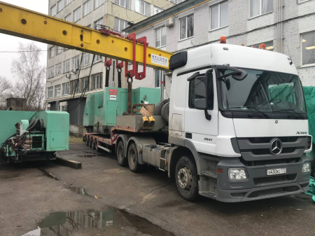
Press releases«Beluga Projects Logistic» is rebranding its logo and external communications. Since 2009, our company has been developing engineering solutions, performing rigging, construction and installation and transport works, organizing river and sea transportation of goods; operates a fleet and lifting equipment, supplies industrial equipment.
We analyzed the changes that had taken place within the company and created a new Client-oriented strategy. This strategy was the starting point for the formation of 4 business directions and 6 fundamental decisions that help industrial companies change the way they build.
As part of the rebranding, a new logo was developed, made in three colors: dark blue, aquamarine, and white. The emphasis in the text part is on manufacturability - BELUGA TEC - Technology, Engineering, Construction. The colors emphasize professionalism and the desire for innovation, the transparency of the company's work, compliance with safety and labor protection requirements, publicity when interacting with partners and the information community. We plan to develop all modern communication channels - official accounts will be created and updated in the social networks Telegram, Zen, VKontakte, YouTube.
BELUGA TEC aims to develop reference solutions for key sectors of the Russian industry.